I am a few days late with this week’s posting and for good reason. I got distracted into writing an essay about Hannah Arendt’s female friendships by a question my editor Louise Bernikow posed after reading part of my manuscript. Louise wanted to know more about Rosalie Colie, one of Arendt’s lesser known friends (lesser know than, say, Mary McCarthy), and Louise’s professor at Barnard in the late 1950s. I had a lot more material on Colie than I’d brought into my book so far and Louise’s comment sent me back to the drawing board or, rather, the computer screen. Within a week I'd written a piece entitled Passionate Thinking: Hannah Arendt’s known and less known female friends. My essay offers much-needed perspective on the complexity of Arendt's friendships with women, and on female friendship more generally, providing a view not fully appreciated, even by recent commentators. For instance, in the aftermath of the new film on Hannah Arendt by Margarethe von Trotta, which includes the first filmic representation of Arendt's friendship with McCarthy, several reviewers have weighed in on whether the portrait of this iconic friendship in von Trotta's film does justice to the kind of friendship that existed between these two intellectually self-confident women. Michelle Dean wrote of her disappointment in The New Yorker book blog.
Nearly every exchange between the two women is about men and love....Women talk about ideas among themselves all the time. It would be nice if the culture could catch up.
I don't disagree with this assessment in general, but think there is much more to the story of Hannah Arendt's friendships with women than has been explored so far. And that's what I do in this new essay. I’d love to share it with you, but can’t post it on my blog until it’s gone through the review process at Guernica, “a magazine of art and politics,” where I sent it for publication consideration. So, stay tuned.
Apart from that productive distraction, while waiting for Louise's final comments, which will take me back to my manuscript for edits, I’ve been busy designing my book.
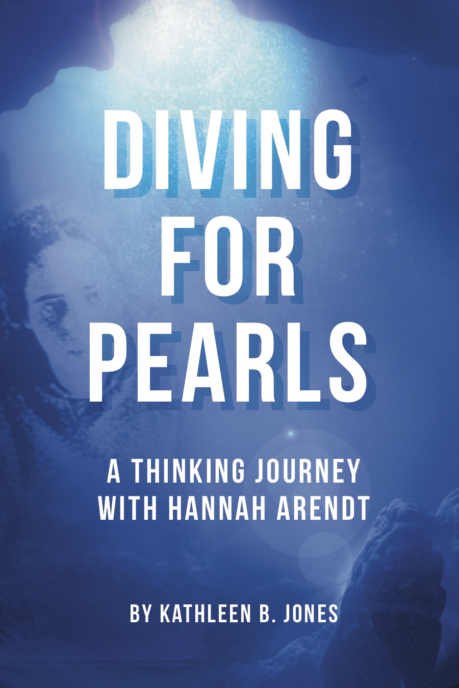
Jeanette Vieira, my graphic designer, sent me new ideas for the cover. We’d been playing around with the idea of creating the cover as a visual allusion to the most recent edition of Arendt’s biography of Rahel Varnhagen. But that idea was hampering Jeanette’s creativity. So, at the brilliant suggestion of someone else, I began to think about images more directly related to my title—Diving for Pearls—and encouraged Jeanette to experiment with them, allowing her visual associations to wander into watery depths.
It turns out it was exactly what Jeanette needed to allow her imagination to soar (or dive, in this case)! She wrote me an enthusiastic email:
The underwater visual provides so much opportunity to illustrate the deeper meaning of the book...Seems there is psychology of the underwater realm that fits well here. I'm much more inclined to, and inspired by this direction after reading the text.
And then she asked me to associate to the places and emotions that emerged for me through the writing. This kind of collaborative process, which I've experienced before in my work in theater, underscores why the self-publishing route, though time-consuming, can result in so much unanticipated and exciting learning for anyone who takes the leap.
Last week Jeanette sent me four samples and, with her permission, I’m sharing them with you now and invite you to comment on which one you think most effective. (I have my own favorite, but really want to hear your responses. Click on the pictures and you'll be able to view them separately in larger format).
As you will note, the differences between the two basic designs are subtle shifts of color and resolution. I’d also like to hear your suggestions on font/typographic design.


I want to avoid the pitfall that Tim Kreider described in a recent posting on the New Yorker’s book blog. Designs are becoming bland and formulaic, he wrote, explaining how and why “most contemporary books all look disturbingly the same, as if inbred.” It’s because of what he called the two rules of book cover design:
The main principles of design—in books, appliances, cars, clothing, everything—1. Your product must be bold and eye-catching and conspicuously different from everyone else’s, but 2. Not too much!
I don’t want my book to succumb to this trend. In fact, most book design blogs that I’ve been reading emphasize the importance of the cover to help make a book stand out from the crowd. So, even though I know most readers will come to my book based on recommendations from friends or fellow readers and writers, I still want it to have a distinctive aesthetic; I want my book to become a “conspicuous exception.”
We’ll continue to experiment until we get exactly the right look to grab a reader’s attention and also communicate what the book is about.
I’m looking forward to your comments and suggestions!